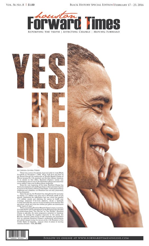
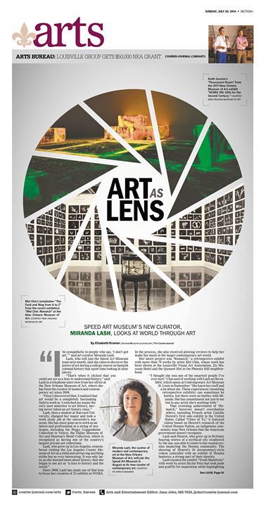
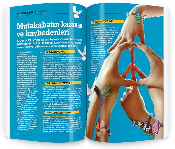
|
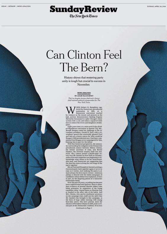
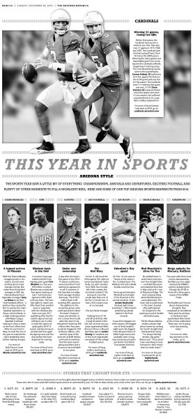
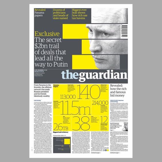
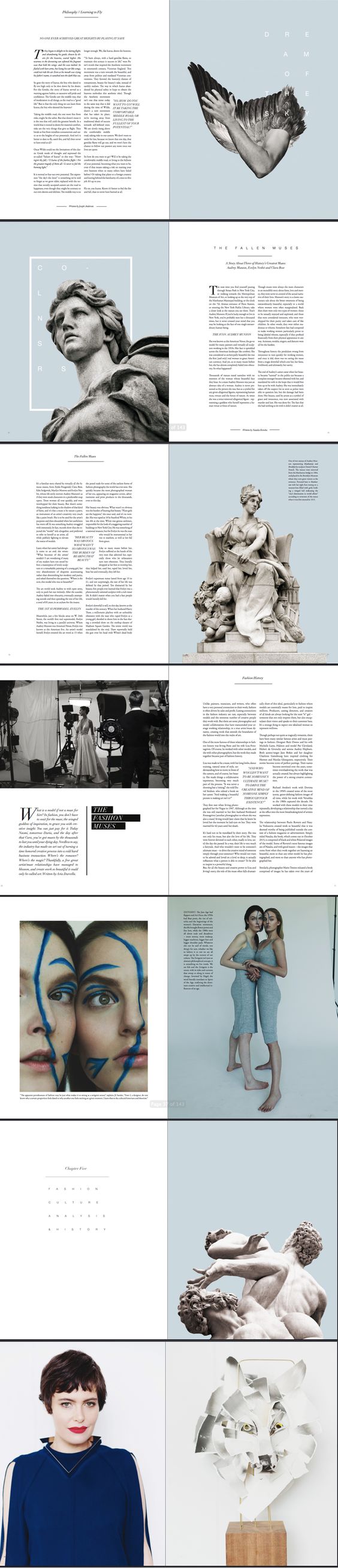
Design needs to be dynamic and explosive. It needs to capture interest and maintain it. I know that, for me, it’s hard to know exactly how to do that. Following the guidelines the 7 principles of design provides is a simple way to get a grip on making your graphics more intriguing and active. So, let’s talk about some inspiration to get creating. balance.The first (and probably easiest to define) principle is balance. You can have symmetry, which is mostly boring but very effective when used in the right context, or asymmetry, which generally does a pretty good job of keeping your design active. Symmetry is predictable; asymmetry is a bit of a surprise every time.
proportion.Next, proportions come into play. When playing with proportions, we effectively make a hierarchy based on sizing. It involves scale and visual relationships, usually in repeating patterns.
contrast.Contrast works in many and mysterious ways. It can be created based on color, typeface, size, texture, etc. The biggest issue I have with contrast is when to stop. It’s super appealing if done in moderation, but could become messy if overdone (kind of like alcohol).
harmony.Harmony is always a hard concept for me to grasp. It seems sort of vague: it involves the structural principles used in a layout. What does that even mean? It’s easier to think of as how you can achieve it rather than what it is. A monochromatic color scheme or using the same typefaces throughout a design can both be ways to achieve harmony.
focus.Focus is one of my favorite design principles, because I love making things bigger than they need to be. But, the whole point of focus is to create a point of interest for a page.
rhythm.Rhythm is almost as hard for me to grasp as harmony. It usually involves the repetition of a certain shape to mimic movement. In case you still don’t get it (I didn’t), a spiral staircase is a good example of this. The steps repeat, and you move up them. Got it?
unity.We’re not done yet? I wish we were done, too, but we still have to talk about unity (also a term that is kind of vague). It’s a repetition of principles, like unity, that come together, like harmony, to create a sense that everything fits. It involves the three-peat rule, which says you should include at least three of each principle you choose to use in your design.
0 Comments
|
AuthorI'm Jess. Tidbits of life that inspire me to do what I love. Archives
April 2017
Categories
All
|
 RSS Feed
